Motion 4: Tracker of All Moving Things
Motion (powered by Mojio Inc.) is an established connected cars platform with a great reputation. Several major clients requested that we design and develop an all in one app that continues to track vehicles and their health PLUS start to track everything else that moves: people, bikes, personal belongings.
This is the most challenging project I worked on for several reasons: very aggressive deadlines, continuously changing and evolving PRD, constant requests for new features throughout the process.
My team and I worked on this project for several months. It was very exciting, very fun and very interesting. Like I said, also very challenging! Which made it double the fun.
Below is a short version of the design process.
Wireframing:
Using a tool called Whimsical, we split up the sections among two or three designers, and created rough mocks of every screen that we will need to create in high fidelity for the final deadline and launch date. We ended up with roughly 300 low fidelity screens in the process. I’m showing a few sections below.
High Fidelity Mock-ups:
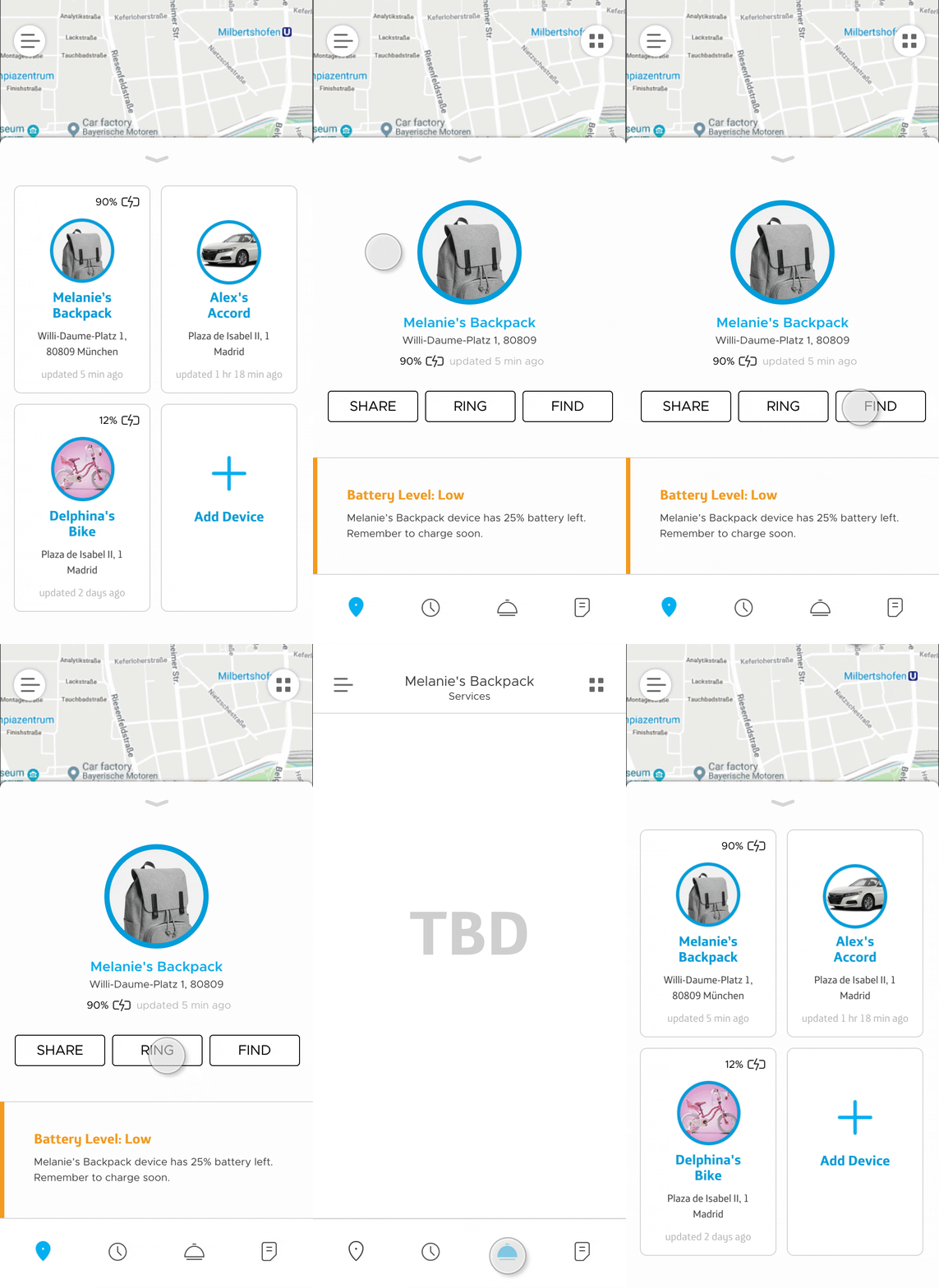
We had to move very quickly and work collaboratively and efficiently. Communication was absolute key during the entire process. We split up sections of the LF screens among two designers and produced HF screen by screen. We noticed a few UX errors in the process and rethought and adjusted as we developed final screen layouts.
To track the progress as well as show the designs to stakeholders and investors, we placed high fidelity screens back into Whimsical so everyone involved could see how the screens connect. Yes, all 300 + screens were updated!
Consistency is an absolute must for any product.
Yet consistency becomes difficult to accomplish when there is a large number of unique minds creating visual content for your product while racing to meet a launch deadline.
This type of problem can only be rectified with one solution: a style guide.
A brand style guide acts as the guiding source of truth for all creative output by aligning designers and developers and ensuring that a unified product is presented to the public.
Thus, the Motion 4 Tracker Style Guide was born.
I’m including a few pages from the guide but I have more to show upon request.
Style Guide Design Process:
I audited current colors in use. We had several different greys, from transparencies to tints and shades. We also had colors in our libraries that were not used in the current product design. I simplified all colors and removed redundancies.
I audited the use of typography and created guidelines that used only certain versions and sizes of Montserrat.
I created a base set of iconography that I can maintain and expand on. It’s currently a combination of custom icons I created from scratch as well as some icons borrowed from the Clarity Design System. I documented all icons and their use. I created a Sketch library through which the icons can be imported as symbols.
I documented various use of components (I am only showing a few components here). I added these to our design system library as well.
The result was a much smoother and more efficient design process and a much more consistent product. The style guide streamlined our efforts in completing the app design tremendously.


