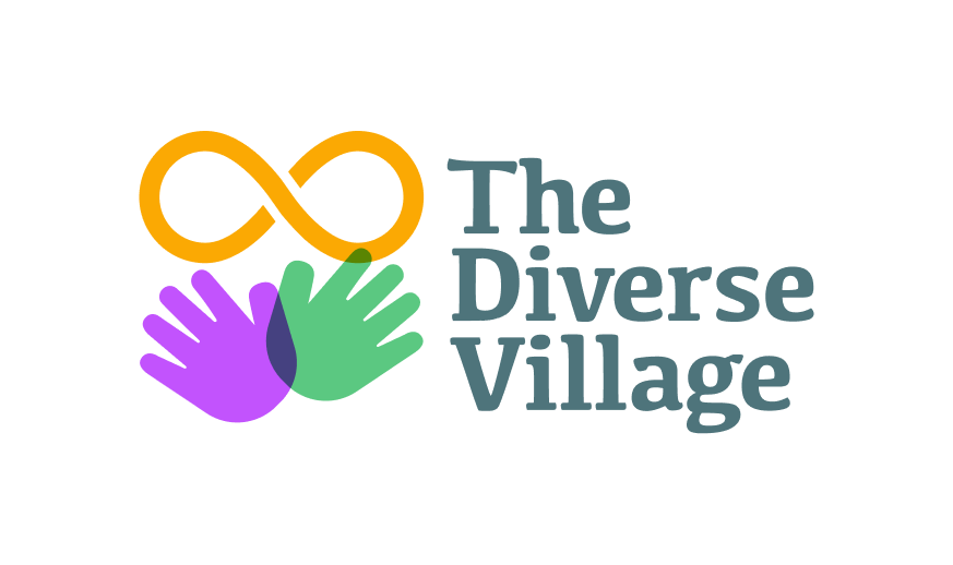
Non-profit logo redesign
This was a pretty quick revamp of an existing logo that the founders of The Diverse Village designed themselves using clipart. They basically wanted a similar concept, but a bit more finesse and approachability.
My Process
When designing logos, whether from scratch or a redesign, I typically follow a process that is both collaborative and quick:
RESEARCH • CONCEPT • DESIGN & ITERATIONS • FINAL DELIVERY
I met with the founders of The Divergent Village, and learned that they are planning to launch a website that will be a valuable resource for families with neurodivergent children. The website will provide families with various support and a collection of activities for kids that are safe and inclusive. The website was nearly complete by the time we met and the founders wanted to review and improve the logo, which they created themselves using clip art.
I reviewed the existing logo as it appears on the website, including mobile web and Google Search. This design is not bad and has all the necessary elements, but can be a bit friendlier and have a stronger presence. For mobile, there may need to be another version of the logo, as well as the mobile web layout would need to adjust for the logo to be legible, which would be step two to the initial logo redesign. Here is the original logo, the way it appeared:
Research and concept phase:
First I conducted a short search of other similar profit and non-profit companies that support kids with ADHD, Autism, and Gender Fluid and Trans kids, as well as professional educational sites. This enabled me to create a mood-board to use as an inspiration and guide, and proceed to sketch ideas that the client and I reviewed and discussed.
Design Phase
Iteration phase is my sandbox, where I experiment with shapes, colors and typography. In this case I used colors that the client selected as accents for their website.
With each project I work on, I always learned something new. While I knew that the lemniscate (infinity symbol) is a symbol for neurodivergence, I thought is was nearly always depicted with rainbow colors. It represents the idea of infinite possibilities and acceptance. I learned that for Autism, it can also be gold.
So I experimented with using many colors to represent the rainbow, and inclusion of all, and also just gold, to target Autism. I explored far out ideas to represent kids and parents, love and acceptance, village and togetherness, and also caring hands protecting the fragile state of neurodivergent individuals, as the original logo symbolized.
Because the nonprofit company will be a resource for parents with divergent kids, I explored playful and more serious use of typography and shapes.
Final Deliverables
After a few tweaks to the logo mark and typography finessing, the logo was finalized and I delivered it to the client in every format they requested.
I will now be proceeding with creating custom illustrations for the website, and other branding and marketing designs for The Diverse Village non-profit, which is the work I truly love and enjoy.


