Personalizer
Personalizer:
This is an existing internal tool used by Outlier Customer Success team. It allows the CSMs to configure what each end user wants to see in their feed. The CSMs go into this tool while on the phone with each customer and select configurations for each section.
Based on business needs, it was decided that we should add one more section to Personalizer: to allow users to enter metrics and select if they want to see each metric fluctuating up or down.
Before beginning work on adding the new function, I first reviewed the current state of the tool in terms of structure and visual presentation, and asked our internal users to show me how they were using this tool and what their pain points were while using it.
Existing Personalizer
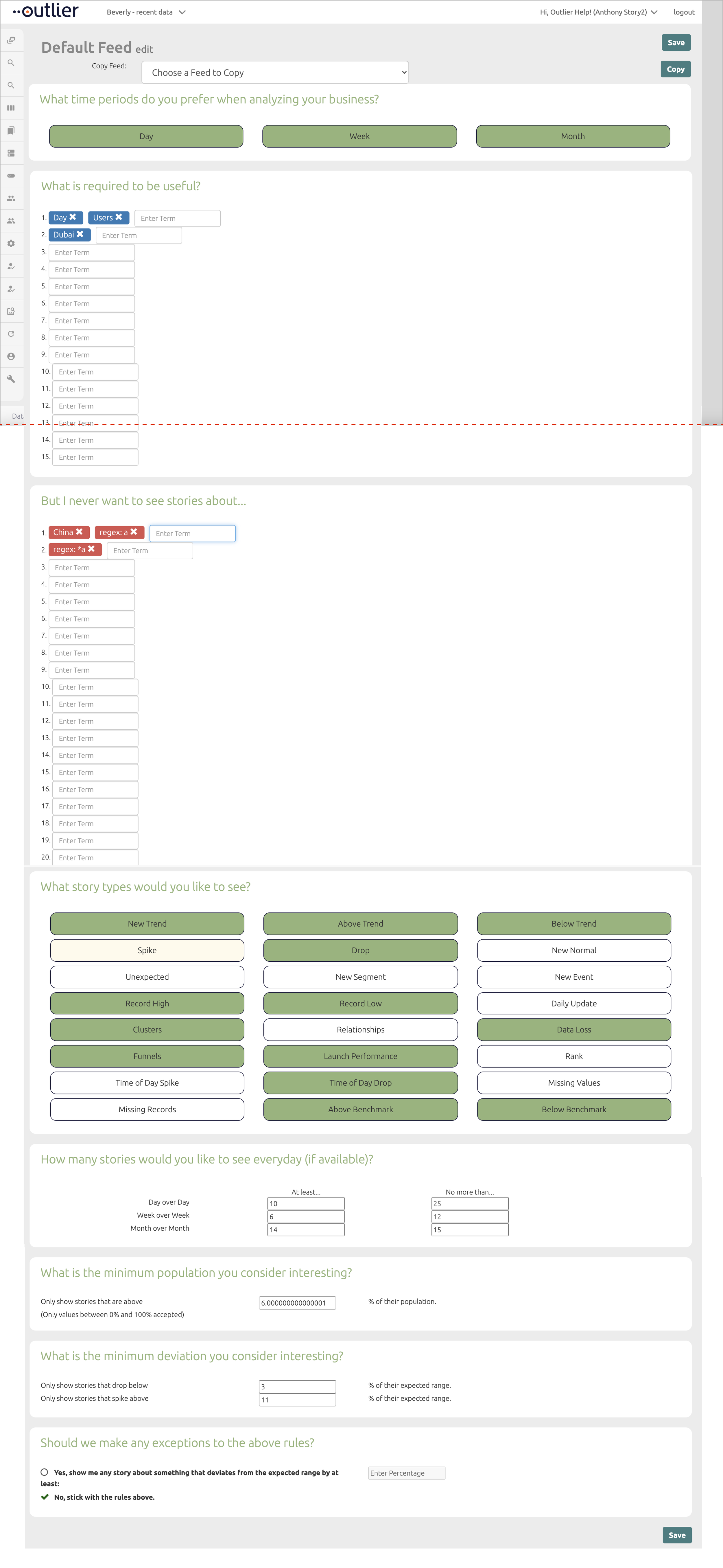
Personalizer tool (reconstructed from screen grabs).
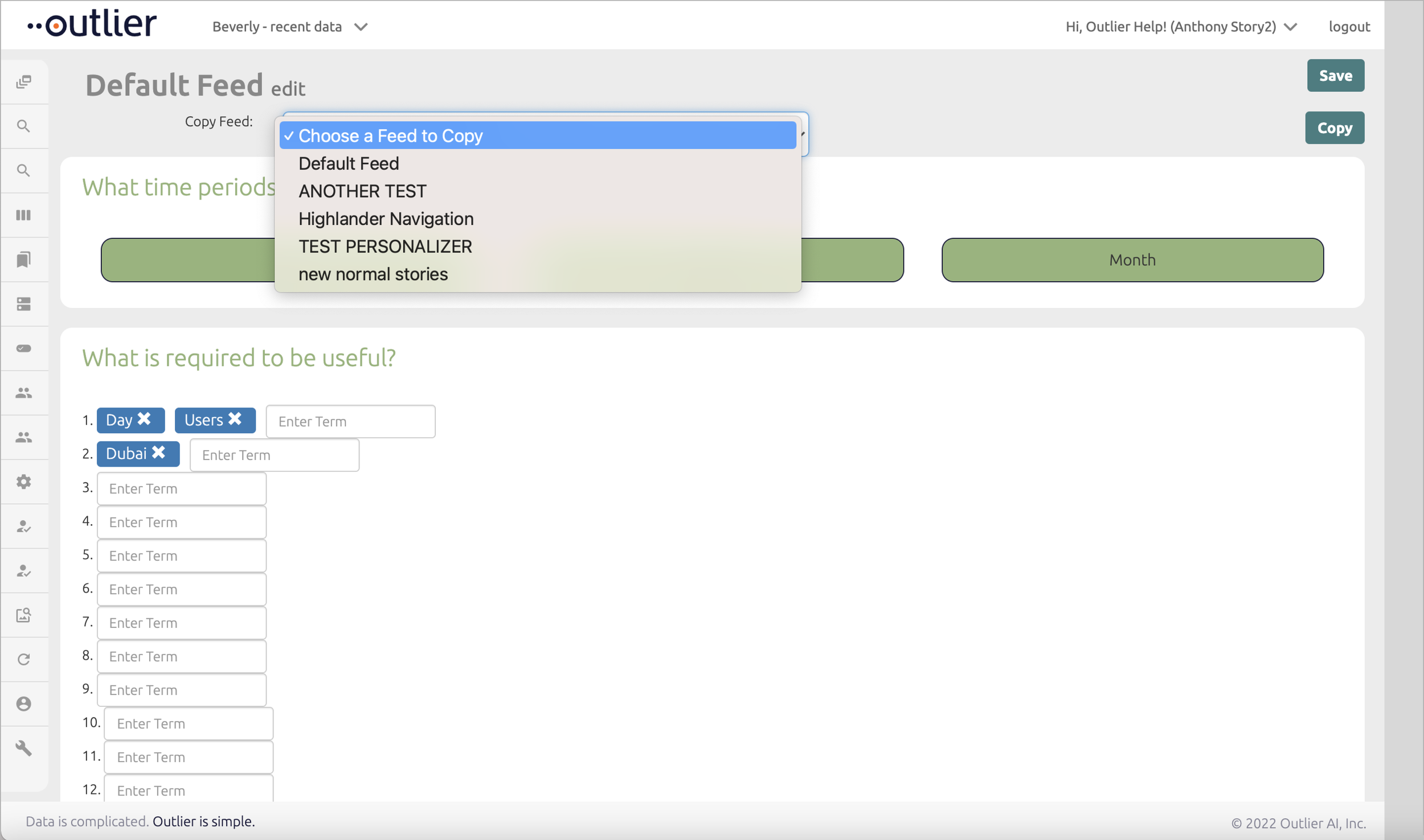
What the activated dropdown looks like.
What’s the problem?
UI is clunky / outdated in style.
Colors are not consistent.
Contrast is missing.
Copying configurations from another feed isn’t very straight-forward.
Copy is not consistent and difficult to scan quickly so the CS team spent a significant amount of time on this tool and often made mistakes. Mistakes in feed configuration take some time to undo, because each time Personalizer is saved, it takes 24 hours for the customer feed to reset.
Disjointed information - some sections can be grouped better (for example time periods , volume and frequency, etc).
Many empty fields already floating upon entry, before a user takes action to add a new field.
CTAs are positioned on top and bottom - forcing the CSM to scroll to find them.
Once the CSM is in the tool, there is no name or any indicator of where they are within Outlier (this and the other issues caused the CS team to take a significant amount of time to train a new team member to use this relatively simple tool).
What I suggested:
Having reviewed the existing tool, I determined that it had a few issues in terms of arrangement of information, structural and visual design that we could address prior to adding another section in the same format. I also saw an opportunity to start testing the brand new Design System that I was creating at the same time. I suggested this to the PM and VP of Product and together with the Engineering team we decided to slightly increase the scope of this project in order to significantly improve the usability of this tool, and to influence other Outlier features by setting a new style.
This was one of the first Visual Design projects I tackled at Outlier, so I presented several different ways of creating a style around the UI (what should the headers and buttons look like moving forward, etc). At the same time as working on the given project I started thinking about bringing in more contrast to the global navigation overall, but that’s a story for another time.
The Product Team reviewed several options for the new template and decided to move forward with Option 3 with some adjustments.
During the process, I redesigned all components to bring them up to a more modern style and I implemented the 8 pixel grid into component design and the overall page layout. I used the new Design System yet I also allowed for this project to guide and influence the DS, so it was a true symbiosis and worked great to design these projects simultaneously.
I will explain my process of creating the DS in more detail as its own project, but at the time of reworking Personalizer, I had the DS basics (colors, text styles, buttons and other components), so I was able to start using it, while continuing to develop UI patterns (hover and active states, checking for accessibility, etc).
At the same time as striving to create a more clean and elegant visual experience, I was always focusing on designing a seamless process of working with the Engineering team. I partnered closely with Eng to make sure that I offer components that they have access to in their React library. Most would only need a few small code tweaks to look the way I intended (removing color backgrounds / strokes / pixel adjustments).
Personalizer, as influenced by the Design System.
At the same time as tackling the overall visual design style and redesigning the existing content of Personalizer, I was focusing on the primary goal of this project - to add another section to this tool, that allows a user to add a metric and then set whether they want to see this metric fluctuating up or down in their Outlier feed. There are always multiple ways of solving any design challenge. sometimes it is based on user feedback, other times on best practices, and sometimes it comes out of the designer’s toolbox of common solutions. I offered a few different ways, and based on our internal user responses, we chose to use use simple radio buttons for this.
Final Design & Handoff
This project was designed in about a week, and the UAT process with Eng took another week, because this was the first introduction of Outlier Eng to partnering with a Designer. It was a very collaborative experience and a huge stepping stone into building our streamlined design process.
All content would now scroll below the page title, so the user can know where they are at any given time. I also anchored CTAs to the bottom so if the user goes into this tool to change one thing, they don’t need to scroll all the way to the bottom of the page.
Hover and active states were developed during this project, and dropdown menus were designed with the 8pt pixel grid and hover states.
User was able to change title inline. Number of stories wouldn’t show up until a user selected a time period. These sections were also combined from the original Personalizer tool where they existed in the beginning and towards the end.
We reworded all section titles to make them more straight-forward for easier skimming. Inclusion and Exclusion rules would auto-populate to help users fill out the form faster.
Error states were included and provided during handoff, and of course the new section with metric fluctuation was added.
At the same time modals and growls were redesigned and built into the DS.
Outcome?
This project was a huge win for us in many ways. First, the user feedback was quite impressive:
Reduced time for CS team to complete this task by 12%
Fewer mistakes made by 35% (which is a really big deal)
UI Patterns were developed
DS expanded and tested
Velocity increased (future features were now implemented much faster!)
These are four subsequent features that I was able to design much faster, thanks to following the improvement process of Personalizer. Consistency and velocity improved tremendously, which for me was the real measure of success for a design team of one.


